One Family website usability testing

One Family is a Brighton-based bank focused on delivering a great product with total transparency. We were asked to perform a series of audits of the site to determine how we could iteratively improve the user experience.
From our research, we found that customers struggled to understand their position within the site and become overwhelmed by the large level of information. While initial meeting demonstrated that reducing the information offered would be a challenge, we decided to focus on improving the sites accessibility and deliver a more structured approach to the product articulation and website structure.
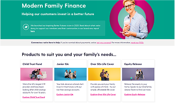
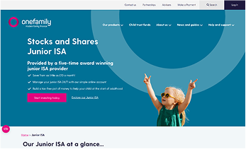
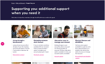
To help assist customers in understanding the site, we decided to introduce a more structured colour system. The purpose of this structured colour system was to help visually separate each product/service and provide visual feedback to users about which section of the site they were visiting.
In testing, we found this provided much needed distinction between products and gave a more meaningful approach to designing and expanding the site. This was further supported by designing set page layouts that help users compare and differentiate each product/service.
To further reinforce the colour scheme, we mind mapping a few solutions and decided to focus on testing multiple navigation forms that would be a first point-of-call to educate users about the link between categories and colours, while also providing a visual list of products/services available. The final navigation was designed to be easy to read and navigated.
Our most recent audit has been focused on combining the login/dashboard for each product into one area, in order to reduce frustration and increase cross-sales.